When @revengeday decided to get a set of Arasaka keycaps for a new keeb project he was building, it was only a matter of time before I purchased them as well. For those of you that missed those posts, here’s where we got the set from: https://www.aliexpress.us/item/3256805744197855.html
Ever since I saw movies like Alien and Blade Runner (and read William Gibson’s stories), I’ve been fascinated with the idea of keyboards with keys that are more icons - potentially for macros - than just boring letters and text. The way that Gibson described cyberdecks and the panel that Ripley uses to arm the self-destruct sequence of the Nostromo in Alien has always made me want to have a keyboard like that. The Arasaka keycap set has a lot of that and I was hooked!
But I have (what I’m finding out to be) a really non-standard keyboard that a lot of people don’t have. Last summer, I was able to acquire a Kinesis Advantage 360. Here’s what the OEM keyboard layout looks like:
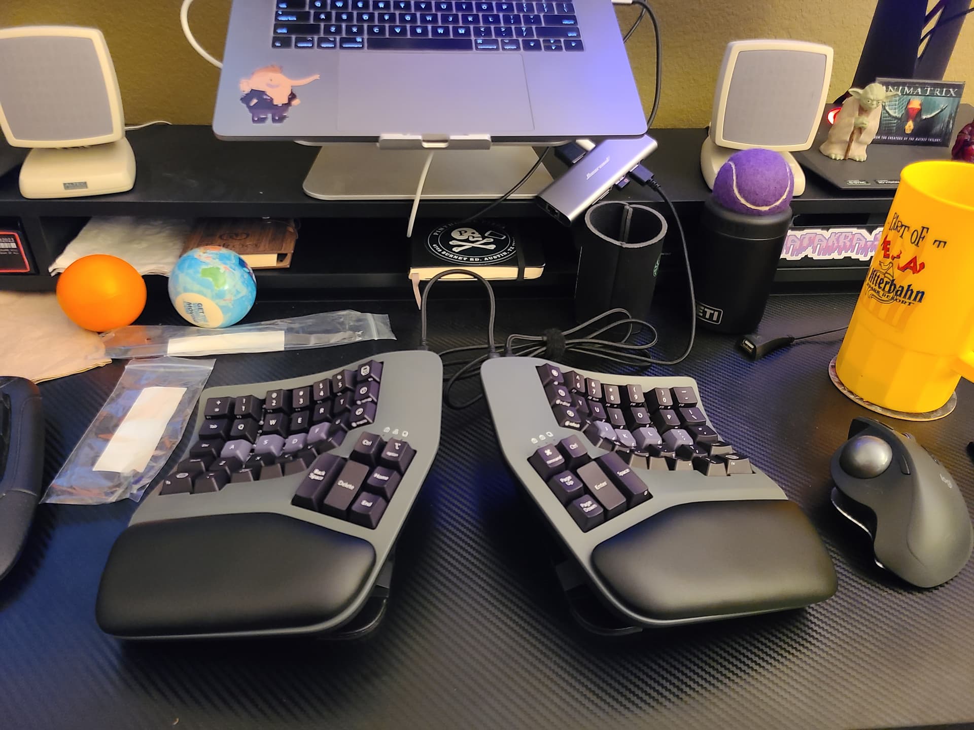
This was my first foray into non-standard keyboard layouts (I mean, go hard or go home, amirite?) but I had never messed with switches and keycaps before. And, once I decided that I had to have those Arasaka caps and got into what it would take to swap them out, I realized that literally everything about the Kinesis is custom (except for the actual switches themselves, I think). Some of the peculiarities of the Kinesis keycaps:
- Fewer keys: Kinesis relies on multiple layers and only 74 keys to get the job done and keep things compact, so that means that in a 104-cap standard set, there’s a fair amount of caps that won’t be used, as well as original caps that have 3 alternate modes printed on them (for instance, the numpad keys)
- Multiple Layers: Many of the keys (particularly those used in the numpad layer) have two alternate functions printed on the face of the key. Since standard layouts don’t usually utilize more than the function layer (and Alt combos aren’t usually printed on the key), replacing them means losing indicators of one of the default keyboard layers that can be used.
- Custom sizes: In order to achieve their ergonomic objectives, the keys are also custom. Everything from width to pitch and depth are all custom made for the curvature of the key bed to minimize finger-stretch.
- Kinesis custom function keys: some of the keys like the “kp” and “v-sync” keys are specific to Kinesis, so those probably shouldn’t be replaced as they have alternate bindings printed on them and I don’t use them enough to have all that memorized.
- Fewer users: due to the price and (I’m assuming) “weirdness” of the keyboard, these keyboards aren’t common, so there’s no reason to develop vanity keycaps for a board that’s this specific in its construction.
But I just had to try, and try I did! I started with the thumb panels, and my first draft layout came out like this:
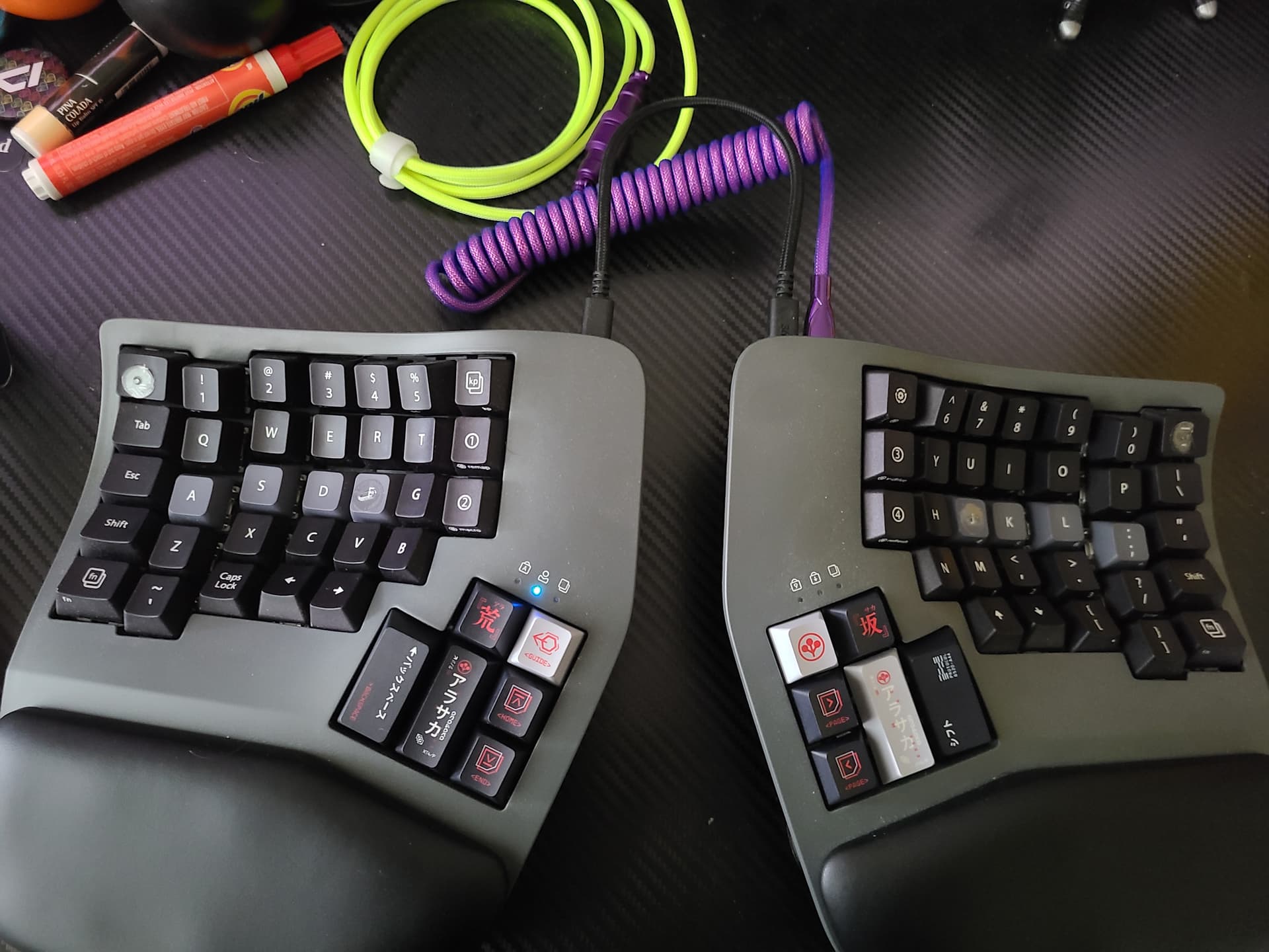
Not terrible! The windows/command/super key became the Arasaka logo, the option key became “guide”, the control keys became japanese characters in brackets and the home/end/page up/page down all got some nice new icons. Of the four “big buttons”, only the “backspace” had a key that was both a) identical to the original and b) labeled as to what it actually does. The other three (from L to R in the picture above - Delete, Enter, Space) all got different unlabeled keys. In this case, I used the color to differentiate the Enter key from the Delete key on the other side (as the graphic is the same) and the Space key just gets some random graphic. ![]()
There’s a camber difference between the 4 “long” keys, which lends to a different feel than the originals which ere all the same size and height. However, I think this might help me touch type as I can clearly feel the difference between the two keys on either side while touch-typing. I’m hoping that this will lead to less mistaken Enter presses than the original layout did.
From there, I just started replacing caps and trying to find the best analogs that I could to each key.
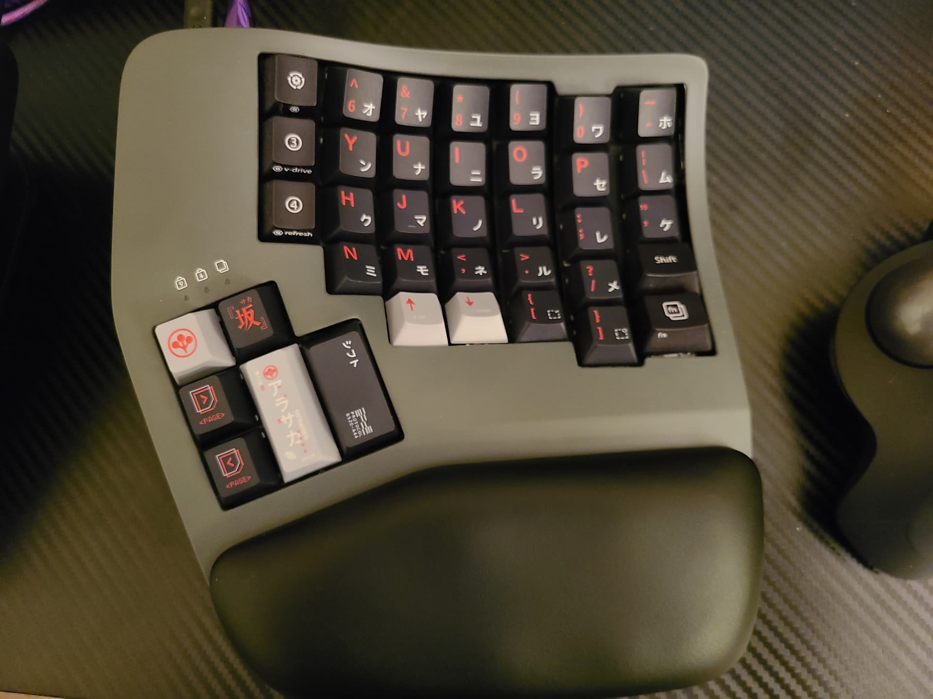
For the right hand, most of the keys in the main bed were just one-to-one replacements. The main issue on this side were that there weren’t any correctly-sized keys for the -/_, |/, and "/’ keys, so I used the smaller, standard ones. You can see the difference between the top 3 keys and the bottom two on the far right line, as the bottom two are original keys (there wasn’t a second “Shift” key that would fit over there).
The left side was more interesting, as more of the functional, non-character keys live there.
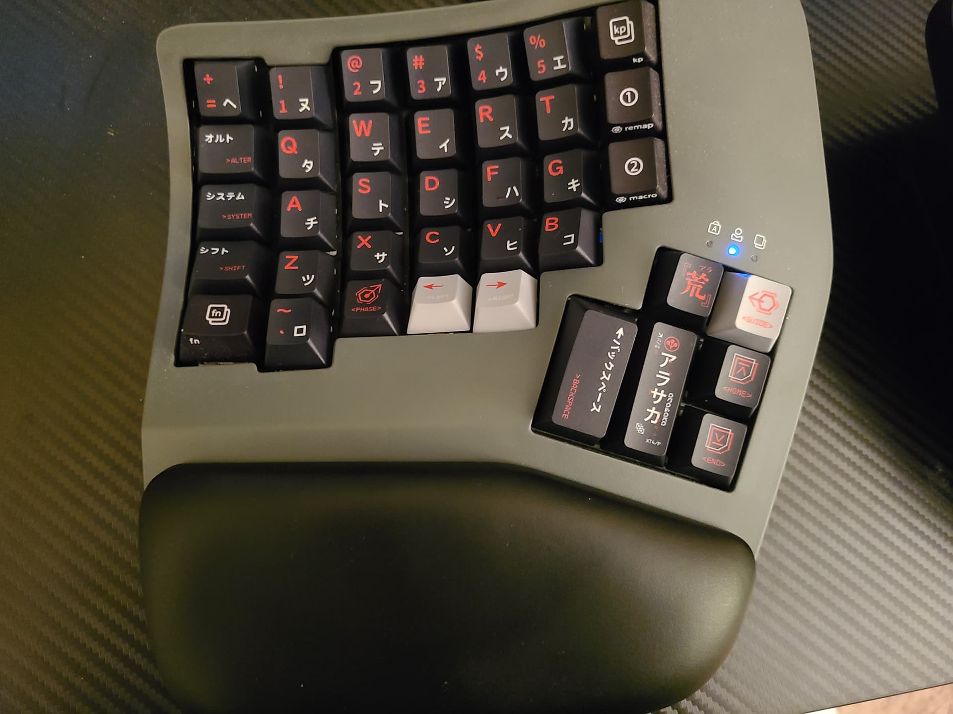
This one was a bit more challenging. The “caps lock” key became “phase” with a neat little hexagonal icon pointing up to the right (figured it was a good analog for “making something bigger”). The Shift key got a valid replacement, ESC became “system”, and TAB became “Alter”. The +/= key had to be a smaller one as on the right side. I could have also replaced both of the function keys on either side but since they already sorta had an icon on there, I just left them as they were.
And here’s the final product, including the new “cyberpunk” connector cable that I got for it:
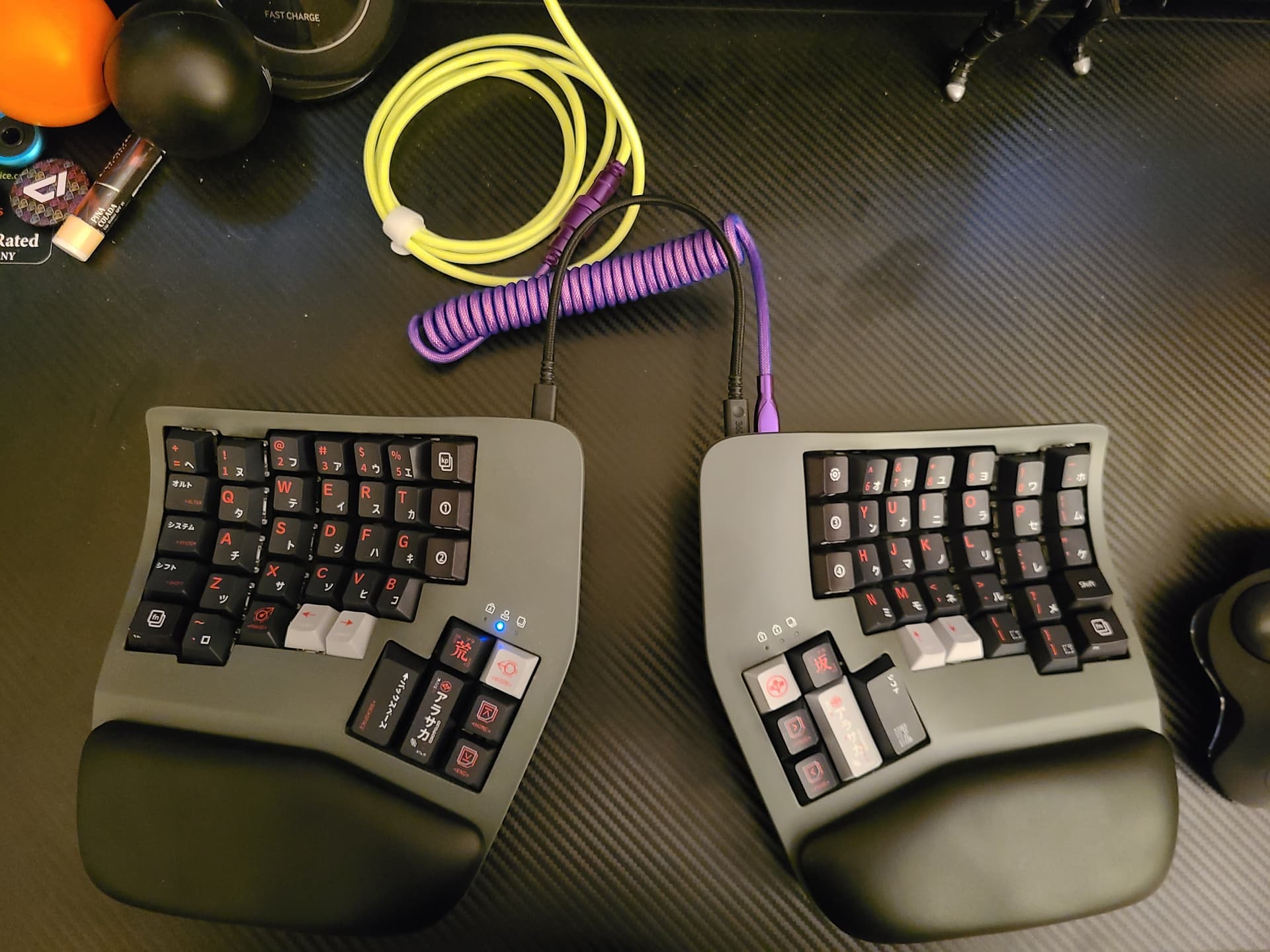
Now it’s just a matter of getting used to the new caps and seeing just how much the improper sizing messes with the day-to-day ergonomics as opposed to the OEM caps. So far, it hasn’t seemed to be too bad or noticeable, and in some cases, actually kind of helpful. One nice thing is that the “home row” place-finder keys (F and J) came with the little tactile bumps molded on the cap, so I didn’t have to use any of my tactile stickers and mess up the keyboard to allow me to touch-type.
Overall, the keycaps are really well-made and make the keebs look really nice. It’s not quite to the level that I want it to be, and it would be totally boss if someone designed a set of these specifically for the Kinesis, but I’m not holding my breath. And they were super cheap, so I figured $30USD was worth spending to help realize my dreams of an icon-based user input method.
And, as if the weirdness of the Kinesis wasn’t already enough to ensure that nobody will be able to use my setup without a lot of effort, now having half the keys as just icons and some of the important keys named things that nobody else would think of will make it nigh-on impossible, which I absolutely love.